As a resident of the state of Ohio, I have grown up surrounded by people who have pride of living in one of America’s true ‘bellwether’ states. For decades of presidential races, the candidate chosen by Ohio would go on to win. In fact, Ohio had a 14-election streak! But over the course of the past four years, Ohio has seemed to shift further to the right in its election patterns.
For this year’s Mapbox challenge, I wanted to dig deeper into this shift in Ohio’s voting habits. Specifically, I am interested in seeing which areas of the state are experiencing these changes, and additionally, if the changes are occurring in only the Presidential sphere, or if similar effects are occurring in US Congressional and Senatorial races.
To get started on the project, first I needed to gather the data. Initially, I wished to use precinct-level data, similar to the sources used in the New York Times’ Extremely Detailed Map of the 2016 Election (if you have never checked this out, do — warning: you may lose a half an hour of your afternoon exploring it). I was able to find this data available on the Ohio Secretary of State’s website, but only for elections since 2012. I wanted to investigate all major elections of the 21st century, so the lack of the first 12 years would be a hit to the quality of my project.
Instead, I decided to use county data from the same website, which has records available going back to 2000. This would give me access to the first two decades of the 21st century, which I believe is a substantial amount of time for a good analysis. County-level data is more limiting in terms of spatial granularity, but I think there is still a lot of value — the county is still able to display regional differences within the state and allows for a map which is simpler to view and analyze.
Once I had decided on county-level data, I proceeded to gather the data for every US House, Senate and Presidential race since 2000. For the sake of simplicity, I included three values for each race: the counts of votes for the Democratic and Republican candidates, as well as an aggregation of all votes for any third-party candidates in the race. Additionally, I included voter turnout and registration data, which was available on a county level.
With the data gathered and cleaned, I was ready to map. For this project, I decided to use Tableau. In previous projects, I have utilized the Mapbox API as well as accompanying tools like Leaflet.js to embed Mapbox mapping into web apps. While that is a more technically impressive approach if well-implemented, I decided it was more important to focus on ease of analysis. Tableau allows for seamless data visualization and an easy pipeline for distribution through Tableau Public.
I added a number of calculated fields and parameters before visualizing. First, I created a year parameter, which allows for easy movement through time. With this parameter, I created additional calculated fields to identify which data fits in the selected year, as well as which data is from the election previous to the selected year. With those two datasets identified, additional calculated fields were created for change over time in voting proportions, turnout and registration.
Visualizations
Presidential, Senatorial and Congressional races over time
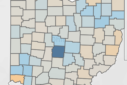
This visualization allows the viewer to move over the past 20 years of elections in Ohio. With each election, the viewer can see not only the share of Democratic votes in a county, but also the change in %D votes from the previous election of that type.
By having all three races next to each other, we can see the effects (or lack thereof) of each on the others. For example, in many of the counties there appears to be an upward trend in Democratic voting in congressional races when Sherrod Brown, the Democratic US Senator, is running for reelection. In contrast, when Rob Portman, the Republican US Senator, is running, we see a shift towards Republicans in congressional races.
There are also times when the trends are surprising. In 2008, the Presidential election saw a near state-wide shift in counties towards the Democratic candidate, but the congressional campaigns saw a Republican shift. In Ohio, ticket-splitting appears to be quite common — in every election, a significant number of counties will go ‘Blue’ in one race and ‘Red’ in another.
Turnout and registration in Presidential races over time
Evaluating the first dashboard made me wonder what some of the causes for the shifts in the state are. For instance, we see a trend in Northeast Ohio and the Mahoning Valley (Youngstown/Warren, OH) shifting further to the right, especially in Presidential races. I have been doing quite a bit of reading on the blight of the rust belt, and I was wondering if there has been any effect on voter registration or turnout in the area. In the city of Youngstown, the population has decreased by nearly 30% in the past 20 years.
Between 2004 and 2020, the number of registered voters declined in Mahoning County from 194,000 to 160,000, but the turnout percentage increased by 3% — and this is not just the 2020 nationwide turnout increase; there has been an upward trend in previous elections.
Congressional results by district over time
I am a resident of Hamilton County, home of the city of Cincinnati — and home to two of the more gerrymandered districts in the nation. In the 2012 redistricting, the Republican-held statehouse split the Democrat-heavy Hamilton County in two, resulting in 0% of the county’s population being represented by a Democrat in Congress.
I was interested in seeing the effects of gerrymandering on voter turnout, so I split up the data by congressional districts. Through filtering by district, we can see the effects of the 2002 and 2012 redistricting. One notable pattern: there seems to be a decrease in voter participation in more partisan districts. In a democracy, the goal should be having as many citizens as possible participating in the process, so increased turnout should be a goal.
Conclusion
Mapping over time is difficult. Too often, we can only look at the results of a single election, which leads to a massive loss of context. By comparing maps year over year, we can pull trends out of geography. These trends can be incredibly useful to people in politics, especially when planning for future campaigns.